Saturday, May 28, 2011

New Concept Stage 1


This image is of my changed designed after last weeks failure of a design. The feedback that I acheived from this week was to not only have a sculpture at the top right of this photos (I drew it via hand when consulting with tutor), but to make a sculpture garden for the public outside. I thought this made my concept of interlinking the cafe with the gallery alot stronger, as it made a more physical connection between the two.

Sunday, May 22, 2011

First week - Site and sketching


For the first week, all I did was put the site into Revit, which is the program I was using. By doing this is also made me think more about the site and its relation to the places around it.

For this week I had some hand sketches. The idea that I presented was extremely week, thus had to go back and come up with a new design. Looking back on it, Im extremely glad my tutor Yoshi told me to start again, as the work that I produced at the end was alot stronger then the first concept

Friday, May 20, 2011

Project 3 Pre-Site Visit


Prior to attending the site with the rest of the people, I wanted to attend to get photos without people in them. Whilst I was there I was luky enough to go inside and experience the place. Whilst i was there I was able to take these panaramas.

Monday, May 2, 2011

FINAL - Week 3 - Use of landscape


I was looking at the relationship to the landscape and last week I noted that the amount of exterior to interior space was nearly equivalent. I had modelled the exterior and interior spaces last week, however thought that they didn’t show how the space was nearly equal. For this reason I endeavoured to find a way that would best display this. I made two quick models, however in the end thought that only one was strong enough to display this information.

I ended up modelling both the exterior and interior spaces again, and placing them on a balance. Once placed on a balance, if the balance is to equal out then it would show that these floor area equal.

To find a building that has equal exterior to interior space is very unusual. Some buildings have exterior space spread out through a large site, however the site that the external areas has been taken from is only the footprint of the building, which is extremely unusual.

I thought that it is a great idea and one that I would love to emulate in my next project. The idea of making private exterior spaces is a great idea, and since this building, many others have been created with rooftop gardens or exterior public areas that are elevated. I thought this model worked well and represented all that I wanted to represent.

FINAL - Week 3 - Use of Colour


After presenting the model last week, I noted that the model was extremely week. After speaking with my tutor, we noted that Le Corbusier could have used full height glass, as it was a free plan. Instead he used captured portioned views. I then wanted to emulate this within a model, hence I started brainstorming more and the finished product is above.

As my concept of last week suggested, Le Corbusier uses colour to bring the landscape into the house. This is done as the main colour he uses is white, and the landscape that surrounds him is green, hence the colours jump towards the person, creating the illusion the landscape is within the building. For this reason I wanted to keep the building inverted.

I created a glass box that represents the external façade. I then placed a roof on top to make the person move their eye to the level below this to experience the model. After the Villa Savoye was built, architects designed building with full height walls as glass, as they were non-structural due to the domino system. As I stated above, Le Corbusier could have had full height glass, however he wanted framed portioned views of the landscape. For this reason there is an opaque material placed to show the Villa Savoye.

I thought that this was an interesting conceptual model. I personally felt that it was interesting, as it allowed me to compare and contrast one of the first building used via the domino effect to buildings post Villa Savoye. I personally like the idea of framed views, as we appreciate the landscape as an artwork, rather than just a view outside.

FINAL - Week 3 - Public Verses Private


For the final presentation I wanted to incorporate the two previous weeks of work, into the one model. I found that the public and private areas being split along the north south axis was crucial to Le Corbusier’s reasons. After studying the sun shadows, it is clear he has placed the private spaces with the morning sun, and public spaces with the afternoon sun, hence positioning the spaces according to the time frame in which they are used most heavily.

It was also important to note that the public area was extremely open. There are ribbon windows around the space, with the only internal wall being a large glass wall and door. This is contrasted to the cellular nature of the private space, which has a lot of room defining walls. For this reason I chose to model the public with transparencies (as open), and the private with card.

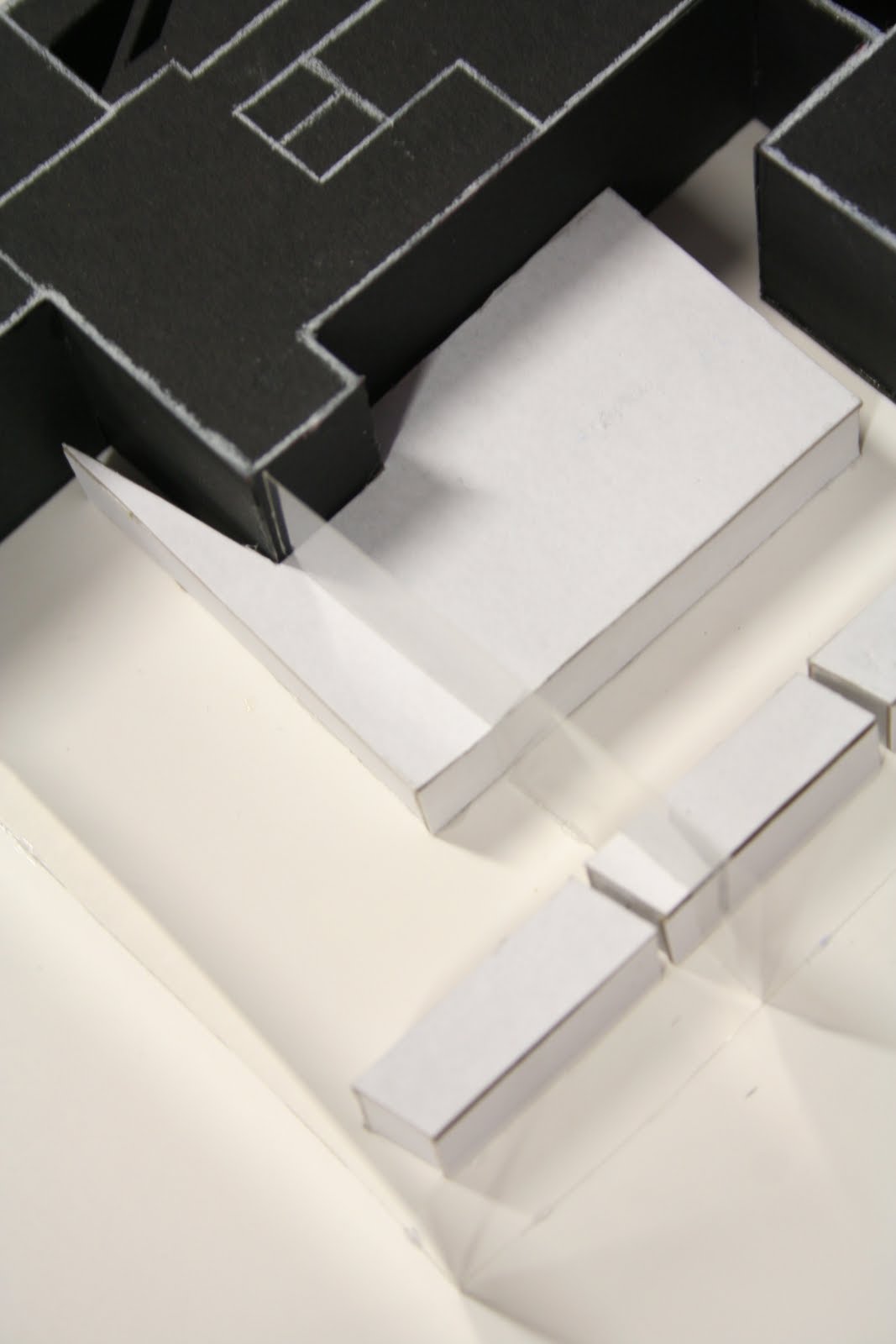
For this final week, I chose to model the 9am shadow for the private space, hence emphasising how the walls create large amounts of shadows, yet at the same time showing how the bedrooms are placed on the east side of the building to allow maximum light in the morning. Also, I modelled the 3pm light for the public space with white card, therefore showing how the public spaces have been placed on the west side of the axis to allow maximum light. Due to modelling two different time frames within the one model, I separated them by firstly using different coloured card, but more importantly modelling the shadow for 9am and the light for 3pm.

Overall I thought that this model was a great success in demonstrating why Le Corbusier has divided the house into public and private, as they are placed due to their function and need for light. I personally found this extremely interesting and it is an aspect I am aiming to emulate in my final project for this studio.